
Mastering Color Management
How to achieve consistent Pantone color matching across all products with expert color management techniques, digital color libraries, and PLM-integrated solutions.
In the fashion industry, color consistency is critical to maintaining brand identity and delivering high-quality products. Even the slightest variation in color can have a massive impact — resulting in missed deadlines, rejected samples, and damaged brand recognition.
Pantone, the global standard for color communication, helps designers and manufacturers maintain accuracy across different textiles, suppliers, and production facilities. However, without a structured color management system, discrepancies still occur. This guide explores how to master color management using modern tools, Delta E tolerances, and PLM systems like Kōbō.
Why Color Management Matters
Color is one of the key decision-making criteria when consumers select products to purchase. Achieving precise and repeatable color results is essential for every fashion brand.
Brand consistency — A signature color should remain identical across multiple seasons, collections, and product categories
Production efficiency — Reducing color variations minimizes sample rounds and production delays
Customer satisfaction — Consumers expect their purchases to match the advertised color in online stores and lookbooks
Supply chain alignment — Multiple suppliers producing the same color need consistent standards
Common Color Management Challenges
Dye Lot Variations
Even with strict quality control, different dye batches can cause slight shifts in fabric color. Temperature, water quality, and dye concentration all affect outcomes. Without spectrophotometric measurement, these variations go undetected until garments are assembled.
Material Absorption Differences
A cotton shirt and a polyester jacket using the same dye formula will appear different because fibers absorb dye differently. Reflectivity, texture, and weave structure all impact how color is perceived.
Supplier and Factory Inconsistencies
Without proper guidelines and spectral standards, different manufacturers may interpret color formulas differently — leading to mismatched batches across your supply chain.
Metamerism (Lighting Conditions)
Colors appear differently under fluorescent, daylight, and LED lighting. Two fabrics may match perfectly under store lighting but look completely different in natural daylight — a phenomenon called metamerism.
Understanding Delta E (ΔE) Tolerances
Delta E (ΔE) is the standard measurement for color difference — the numerical distance between two colors in the CIE color space. A spectrophotometer measures reflectance values at wavelengths from 400 to 700 nm and calculates Delta E values for hue, value, and chroma.
| ΔE Value | Perception | Industry Standard |
|---|---|---|
| ΔE < 0.5 | Imperceptible difference | Excellent match |
| ΔE 0.5 – 1.0 | Very slight difference, trained eye only | Acceptable match |
| ΔE 1.0 – 2.0 | Noticeable to trained observer | Marginal — review required |
| ΔE > 2.0 | Obvious difference to average person | Reject — requires re-dye |
Beyond overall ΔE, it's important to specify tolerances for individual components:
ΔL* (Lightness) — How much lighter or darker the color appears
Δa* (Red-Green axis) — Shift toward red or green
Δb* (Yellow-Blue axis) — Shift toward yellow or blue
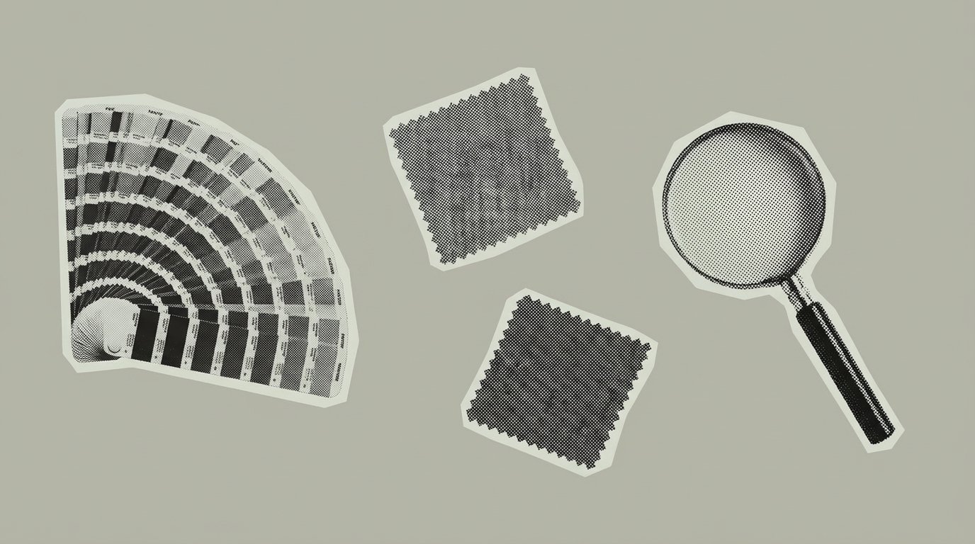
Understanding Pantone for Fashion & Textiles
Pantone operates two color-matching systems. Understanding which to use is critical for fashion applications:
| System | Code Format | Use Case |
|---|---|---|
| Pantone Matching System (PMS) | 123 C / 123 U | Graphic design, print, packaging (coated/uncoated paper) |
| Fashion, Home + Interiors (FHI) | 17-1563 TCX | Textiles, fabrics, soft goods |
| Fashion, Home + Interiors (FHI) | 17-1563 TPG | Pigments, coatings, hard goods |
Each season, the Pantone Color Institute releases Fashion Colour Trend Reports for New York and London Fashion Week, providing the industry's semi-annual color forecast. These colors are selected from the FHI system and serve as the global reference for seasonal palettes.
The Lab Dip Approval Process
A lab dip is a sample of fabric dyed to match your color standard. When arranging a lab dip, you provide the factory with a specific Pantone reference or physical swatch — this becomes your color standard that the lab dip must match (DTM: Dyed to Match).
Traditional Lab Dip Process
The traditional process is slow and expensive:
Submit color standard — Send Pantone reference or physical swatch to supplier
Factory dyes sample — Supplier creates lab dip and ships physical sample
Visual evaluation — Design team reviews under light box, approves or rejects
Repeat if rejected — Ship comments back, wait for next attempt
This traditional process typically takes 40–50 days from initial submission to final approval, with multiple physical samples shipped internationally.
Digital Lab Dip Process
With digital color management, the process is dramatically faster:
In the digital process, vendors measure their lab dips using spectrophotometers and submit spectral data (.QTX files) for digital evaluation. Brands can approve or reject instantly based on Delta E values — no waiting for physical samples to ship.
How to Achieve Consistent Color Matching
Step 1: Establish a Standardized Color Library
A digital color library is essential for ensuring that all team members, suppliers, and manufacturers reference the same standardized palette.
Define colors with spectral data — Store Lab values, not just Pantone codes
Maintain physical references — Keep fabric swatch samples for visual validation
Store dye formulations — Archive approved recipes in a central database
Specify tolerances — Set ΔE limits for each color and material type
Define illuminants — Specify standard lighting (D65 daylight, F11 fluorescent, etc.)
Step 2: Use Spectrophotometers for Measurement
Reflectance spectrophotometers measure colors objectively using the CIE-1976 system. They capture reflectance values at 10nm intervals from 400–700nm, enabling precise Delta E calculations.
Key spectrophotometer manufacturers for textiles include:
Datacolor — Industry standard for textile color measurement
X-Rite — Textile Color Hub enables digital lab dip submission
Konica Minolta — Portable and benchtop solutions
Step 3: Test Under Multiple Light Sources
To catch metamerism issues, evaluate colors under multiple standardized illuminants:
| Illuminant | Description | Use Case |
|---|---|---|
| D65 | Average daylight (6500K) | Primary standard for color matching |
| D50 | Horizon daylight (5000K) | Graphic arts, print matching |
| F11 / TL84 | Store fluorescent lighting | Retail environment simulation |
| A | Incandescent / tungsten | Home lighting simulation |
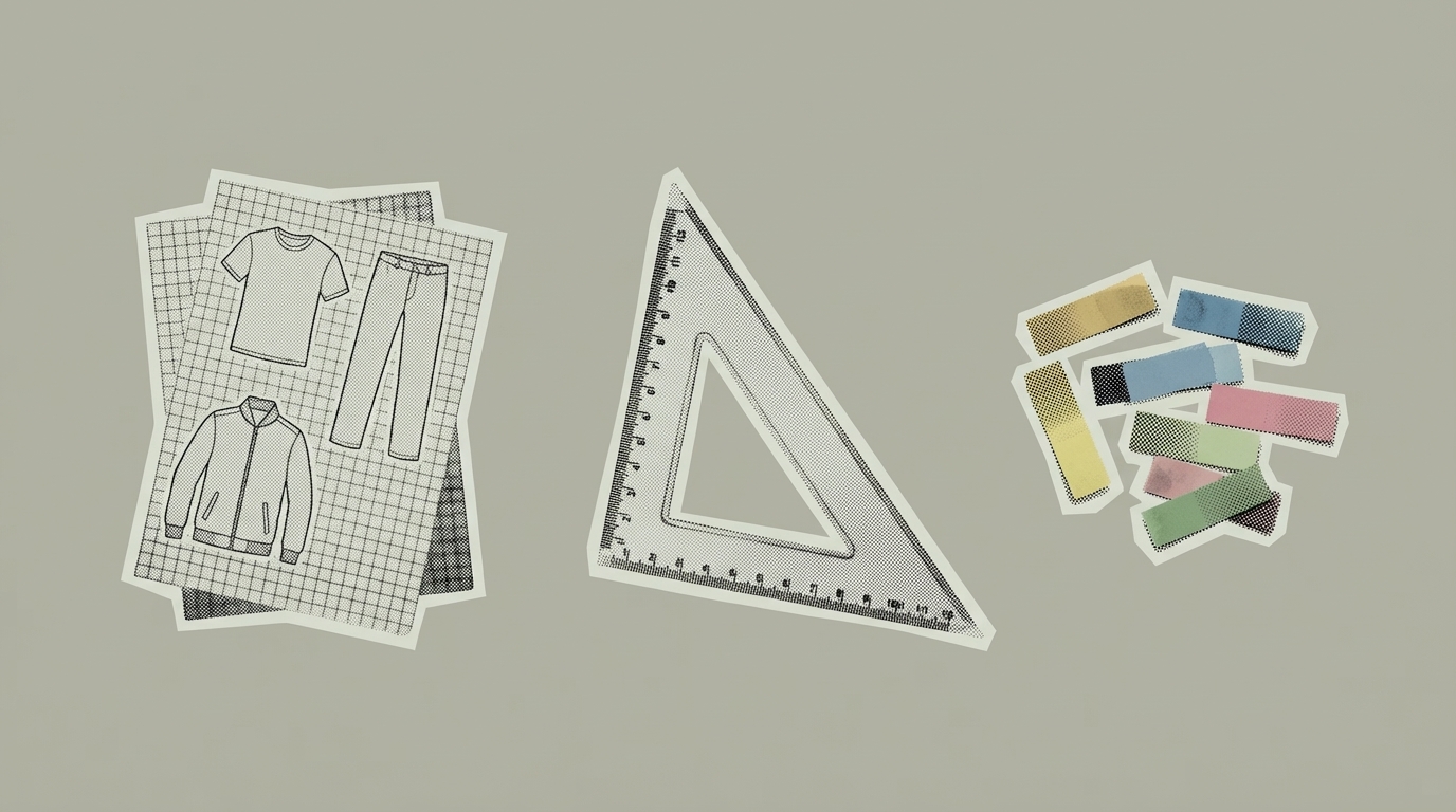
Step 4: Conduct Lab Dips for Material Variations
The same Pantone color will appear different on cotton, polyester, silk, and leather. Conduct separate lab dips for each material type and adjust formulations accordingly.
Step 5: Implement Digital Approval Workflows
Use PLM-integrated digital approvals to review spectral data in real-time. This eliminates shipping delays and ensures all stakeholders evaluate the same objective measurements.
Color Management Software & Tools
Pantone Connect
A cloud-based color matching tool that integrates with Adobe Illustrator, Photoshop, and InDesign. Access over 15,000 Pantone colors, save custom palettes, and convert colors across print, digital, and textile applications.
X-Rite Textile Color Hub
Enables brands and suppliers to securely communicate spectral data, tolerances, and illuminants. Evaluate lab dips digitally without physical samples — achieving 95% accuracy on first attempt and improving time to market by 75%.
Datacolor Match Textile
Industry-standard formulation software for textile dye houses. Calculates optimal dye recipes based on spectral targets and reduces dye consumption through precise color matching.
Adobe Color
Create harmonized color palettes based on color theory rules. Provides Hex, RGB, and CMYK values for digital consistency. Integrates with Creative Cloud for seamless design workflows.
Kōbō PLM
Stores color standards and dye formulations alongside tech packs, linking color approvals directly to product development. Ensures manufacturers and suppliers always access the latest color updates with version control and audit trails.
How Kōbō Improves Color Consistency
Centralized Color Library
Kobo enables brands to create and manage a single source of truth for color specifications. Every team member and supplier works from the same references — no more conflicting swatches or outdated Pantone codes.
Real-Time Color Approvals
With digital color approvals in Kobo, brands can review spectral data instantly. Comments and adjustments flow in real-time, reducing sample rounds from weeks to days.
Supplier Integration
Manufacturers access color standards, dye recipes, and tolerances directly in Kōbō through supplier portals. Every production run references the latest approved specifications.
Color-to-Tech Pack Linking
Colors are linked directly to styles, materials, and BOMs. When a color is updated, all associated tech packs reflect the change automatically — eliminating version control issues.
Audit Trail & Reporting
Track Pantone and Lab values across collections to maintain color consistency year after year. Generate reports on approval rates, rejection reasons, and supplier performance.
Common Mistakes and How to Avoid Them
Relying only on monitors for approval — Always validate with physical swatches under standardized lighting, or use spectral data for objective evaluation
Skipping lab dips and strike-offs — Conduct lab dips for every color/material combination before finalizing production orders
Inconsistent dye formulations across suppliers — Maintain strict dye formulations, spectral standards, and tolerance specifications accessible to all suppliers
Not specifying light sources — Always specify D65 (or your primary standard) and test under secondary illuminants (F11, A) to catch metamerism
Using the wrong Pantone system — Use TCX codes for fabric, TPG codes for trims and packaging. Never mix systems
Color Management Checklist
Conclusion
Color management is a critical component of fashion product development. The traditional visual approach — shipping physical swatches, waiting weeks for approvals, and relying on subjective assessment — is being replaced by digital workflows that deliver 70% faster approvals and 90% first-hit rates.
Move from subjective to objective. By using Pantone TCX/TPG standards, spectrophotometers, Delta E tolerances, and PLM systems like Kobo, brands can ensure color consistency across materials, suppliers, and collections — while dramatically reducing time and cost.
Define your color standards with Lab values and Delta E tolerances, store them in your PLM, and enable suppliers to submit digital lab dips. The result: faster approvals, fewer rejections, and consistent color from concept to customer.

Joe's the founder of Kōbō Labs. Before this, he founded Satta, a fashion brand he scaled to sell internationally at Mr Porter, SSENSE, and Beams Japan. A decade of running his own brand — design, suppliers, production, the lot — is what Kōbō is built on.
Related Articles

Need consistent color across your entire supply chain?
Kobo links color standards, lab dip approvals, and spectral data directly to your tech packs — so every supplier works from the same source of truth.
Book a Discovery Call